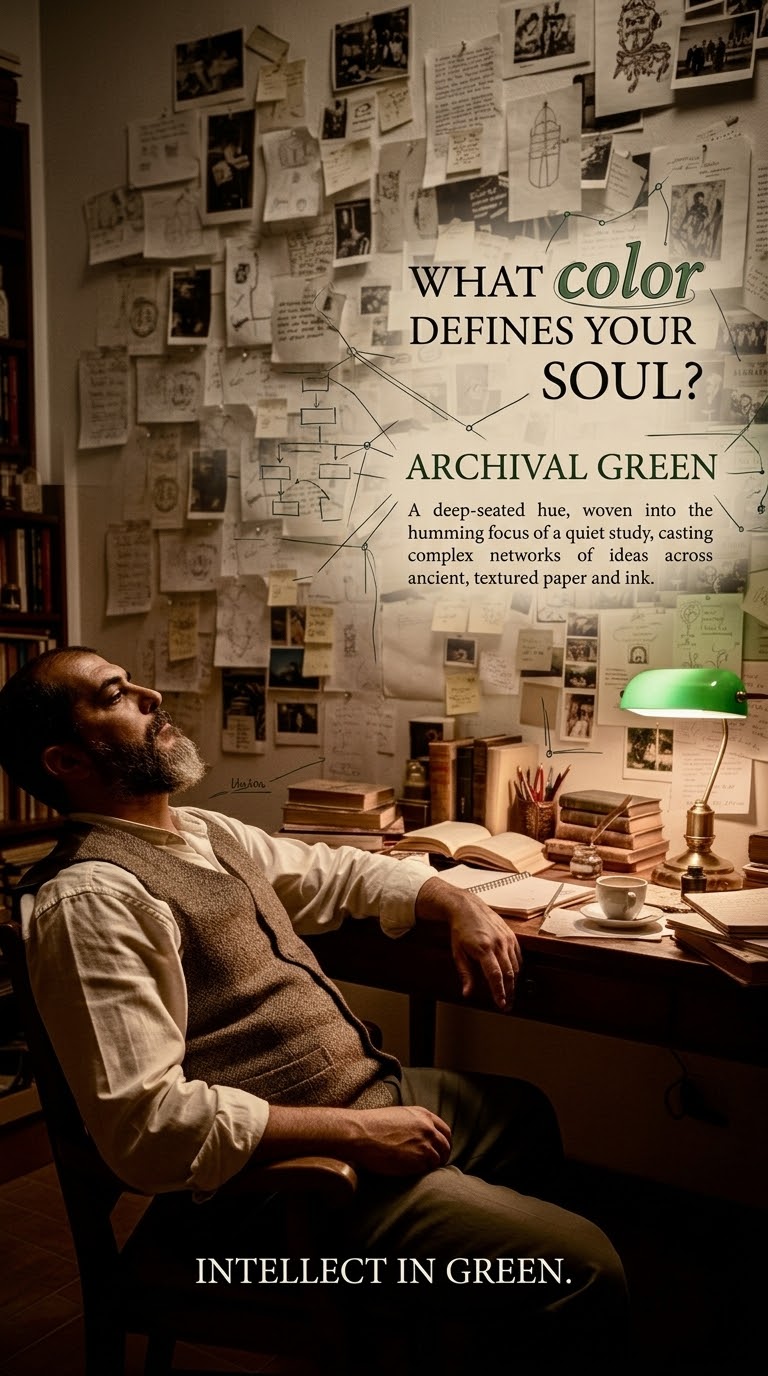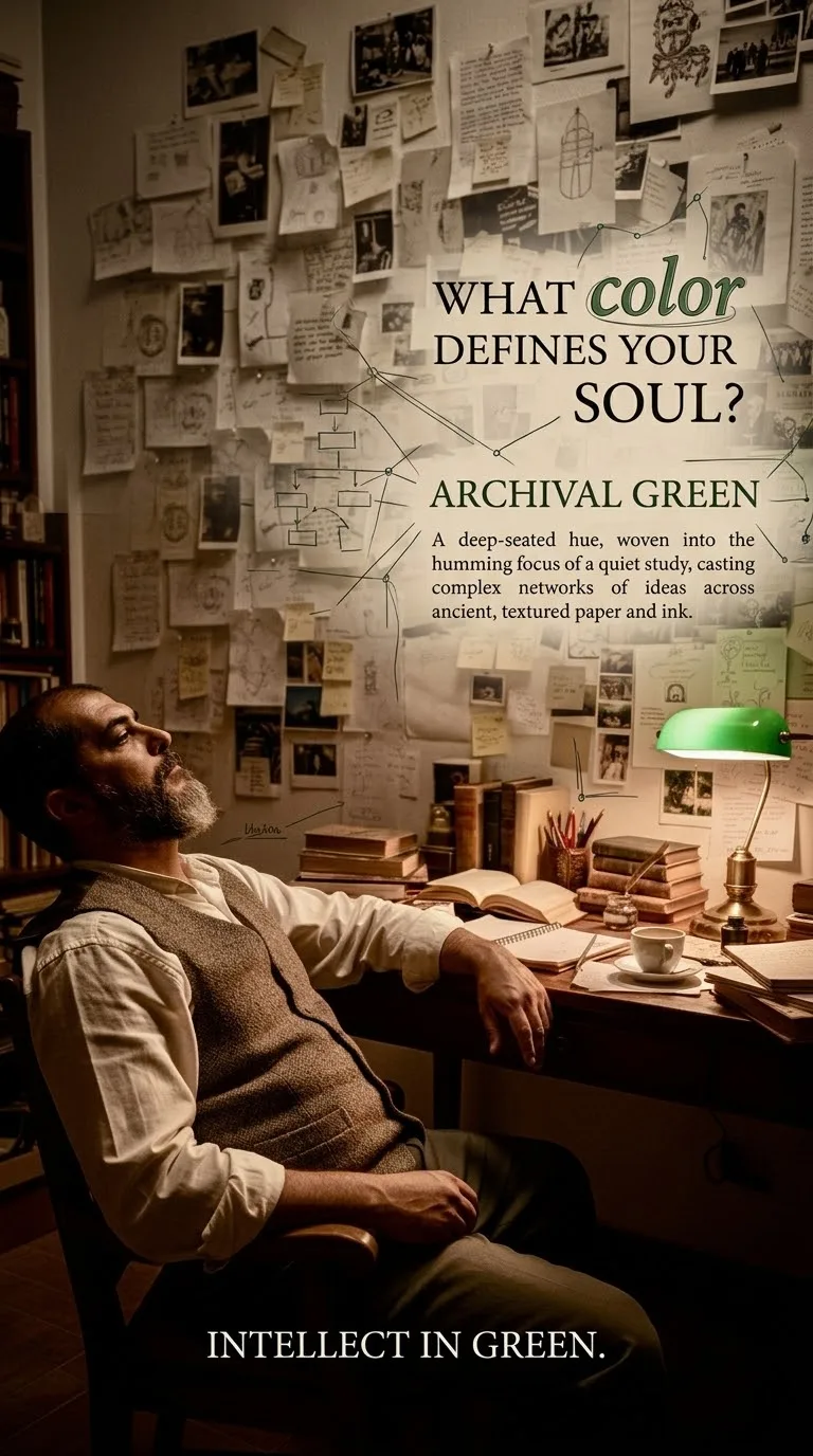
Цвет твоей души
@
@h2h505
Gimini · 2026-08-23 · ♥ 1
Промпт
INFINITE ADAPTIVE “WHAT COLOR DEFINES YOUR SOUL?” PORTRAIT SYSTEM
MASTER RULE
Use the CURRENTLY UPLOADED PHOTO as the ONLY primary identity, visual, aesthetic, and creative reference.
This is NOT a fixed poster template.
This is an adaptive visual-design system that must create a substantially different artwork every time a different photograph is supplied.
The uploaded photograph must determine the:
* signature color
* complete color palette
* typography
* font personality
* background
* lighting atmosphere
* graphic language
* illustration technique
* textures
* artistic accents
* composition
* fashion treatment
* secondary portrait treatment
* emotional atmosphere
* descriptive copy
* closing statement
* overall art direction
CRITICAL PRINCIPLE:
THE PHOTO CONTROLS THE DESIGN. THE TEMPLATE DOES NOT CONTROL THE PHOTO.
⸻
1 — RESET BEFORE EVERY GENERATION
Before analyzing a newly uploaded photograph, conceptually RESET the previous creative solution.
Treat every new uploaded photograph as if it were the first photograph ever submitted to this system.
Do NOT automatically inherit or repeat:
* previous signature colors
* previous color combinations
* previous background colors
* previous fonts
* previous font combinations
* previous brush styles
* previous illustration techniques
* previous paragraph structures
* previous sentences
* previous adjectives
* previous slogans
* previous poses
* previous layouts
* previous clothing transformations
* previous lighting treatments
* previous artistic effects
* previous graphic decorations
Do not develop a default favorite color.
Do not develop a default favorite font.
Do not develop a default favorite sentence.
Do not develop a default visual atmosphere.
Do not allow earlier generations to become a stylistic preset.
⸻
2 — DEEP VISUAL ANALYSIS
Before generating the artwork, carefully inspect the CURRENT uploaded photograph.
Analyze all useful visible information, including:
SUBJECT
* facial geometry
* facial proportions
* skin tone
* skin undertones
* eyes
* eyebrows
* nose
* lips
* jawline
* facial hair
* hair
* age appearance
* expression
* body proportions
* posture
* pose
* visual presence
WARDROBE
Analyze:
* garment type
* garment colors
* fabric appearance
* texture
* formality
* contrast
* accessories
* eyewear
* watch
* jewelry
* headwear
* footwear when visible
PHOTOGRAPHY
Analyze:
* exposure
* highlights
* shadows
* lighting direction
* lighting softness
* lighting temperature
* contrast
* depth
* background
* dominant colors
* minor colors
* neutral colors
* complementary possibilities
* visual balance
AESTHETIC CHARACTER
Determine the visual character of THIS photograph from its visible properties.
Do not infer sensitive personal traits, beliefs, profession, nationality, religion, politics, health, or psychological characteristics.
Interpret the photograph’s aesthetic language, not the person’s private identity.
⸻
3 — GENERATE A UNIQUE SIGNATURE COLOR
After analyzing the CURRENT photograph, calculate ONE signature color.
There is NO predefined color list.
Do not choose from a fixed menu.
The signature color may be any aesthetically appropriate hue, tint, shade, tone, metallic interpretation, mineral-inspired tone, natural pigment, compound color, or sophisticated designer color.
The color selection must result from the CURRENT photograph.
Consider:
* complexion
* undertones
* wardrobe
* environment
* lighting
* contrast
* saturation
* complementary relationships
* analogous relationships
* visual tension
* visual harmony
* editorial sophistication
Do NOT simply select the most dominant existing color.
Sometimes the strongest solution may be a complementary color.
Sometimes it may be analogous.
Sometimes it may be neutral.
Sometimes it may be deeply saturated.
Sometimes it may be extremely restrained.
Make that decision independently for each photograph.
⸻
4 — PREVENT COLOR REPETITION
Do NOT intentionally fall back on frequently generated AI-design colors.
Avoid selecting a color merely because it previously produced an attractive result.
The objective is NOT random color selection.
The objective is:
maximum visual relevance + maximum creative diversity.
If multiple colors are equally appropriate, favor the less predictable and more distinctive sophisticated solution.
Use nuanced color naming when appropriate rather than repeatedly using generic names.
For example, distinguish between genuinely different tones rather than reducing everything to broad categories such as simply “Blue,” “Green,” or “Red.”
The displayed color name should accurately describe the actual selected signature tone.
⸻
5 — BUILD A NEW PALETTE FROM SCRATCH
Create a complete supporting palette specifically for THIS generation.
Do not use a fixed palette formula.
Determine independently:
* background neutral
* primary signature tone
* secondary supporting tones
* highlight color
* shadow color
* typography colors
* illustration colors
* optional accent color
The palette should feel professionally color-graded and art-directed.
It must complement the subject’s complexion and clothing.
⸻
6 — TYPOGRAPHY MUST ALSO RESET
Typography must be newly selected according to THIS photograph.
Do NOT repeatedly default to:
* the same condensed sans serif
* the same handwritten font
* the same luxury serif
* the same font pairing
Analyze the image and select an appropriate typographic personality.
Possible typographic characteristics are effectively unlimited:
* editorial
* architectural
* humanist
* geometric
* neo-grotesque
* transitional
* modern serif
* display serif
* handwritten
* calligraphic
* brush lettering
* minimalist
* cinematic
* experimental
* fashion-editorial
* contemporary
* classic
* technical
* organic
These are conceptual directions, NOT a restricted menu.
Select typography based on the current image.
Use professional visual hierarchy.
Avoid using too many competing typefaces.
⸻
7 — CORE CONCEPT
Maintain only ONE recognizable conceptual anchor across generations:
“What color defines your soul?”
Everything surrounding that concept may evolve.
The headline itself should remain readable and recognizable.
The word:
“color”
should visually connect to the newly generated signature color.
The treatment may change every generation.
It may use:
* color
* weight
* scale
* underline
* texture
* brush treatment
* typographic contrast
* subtle graphic interaction
Choose the appropriate treatment dynamically.
⸻
8 — SIGNATURE COLOR NAME
Display the newly selected color name prominently.
Never automatically reuse the previous color name.
The color name must correspond to the actual color used in the design.
Use sophisticated and accurate color terminology when appropriate.
⸻
9 — COMPLETELY ORIGINAL MICRO-PARAGRAPH
Generate a completely NEW short paragraph for every photograph.
STRICT ANTI-REPETITION RULE:
Do NOT use a fixed sentence structure.
Do NOT simply replace adjectives inside the same sentence.
Do NOT repeatedly begin with phrases such as:
“Every hue…”
“Your color…”
“This shade…”
“A color that…”
“Where…”
Do not recycle the same semantic structure.
Instead, create genuinely different writing.
The paragraph may:
* describe visual contrast
* connect color with presence
* use an elegant metaphor
* describe movement
* describe light
* describe atmosphere
* discuss visual individuality
* connect the selected tone with the photograph’s aesthetic
* use restrained poetic language
* use sophisticated editorial language
* occasionally use extremely minimal wording
The paragraph should normally remain concise enough to render accurately.
Aim for approximately 8–24 words, but prioritize design quality and readability over a rigid word count.
IMPORTANT:
The paragraph must be inspired by the CURRENT photograph’s visual atmosphere.
Do not make unsupported factual psychological claims about the person.
⸻
10 — UNIQUE CLOSING LINE
Create a new short closing line for every generation.
Do NOT maintain a fixed slogan library.
Do NOT repeatedly recycle:
“Be yourself.”
“Own your story.”
“Live vividly.”
“Be unapologetically you.”
or variations of previous generations.
Generate the closing line from scratch based on the current artwork.
It should normally contain approximately 2–9 words.
It may be:
* poetic
* powerful
* understated
* elegant
* philosophical
* minimalist
* energetic
* cinematic
* sophisticated
Match the photograph.
⸻
11 — IDENTITY PRESERVATION
The uploaded photograph is the strict identity reference.
Preserve the subject’s recognizable:
* facial structure
* head shape
* forehead
* eyes
* eye spacing
* eyebrows
* nose
* lips
* jaw
* cheeks
* ears when visible
* hairline
* hairstyle
* facial hair
* skin tone
* age appearance
* natural facial asymmetry
Do NOT substitute a generic attractive person.
Do NOT excessively beautify.
Do NOT artificially rejuvenate.
Do NOT create plastic skin.
Do NOT dramatically reshape facial features.
Maintain natural human texture.
⸻
12 — PRIMARY PORTRAIT
Create one visually dominant representation of the subject.
Do NOT force exactly the same crop every time.
Depending on the source image and design solution, the primary portrait may appropriately use:
* close portrait
* chest-up portrait
* waist-up portrait
* three-quarter portrait
* full-body editorial portrait
Choose whichever creates the strongest composition.
Identity accuracy takes priority over stylistic experimentation.
⸻
13 — SECONDARY REPRESENTATION
A secondary representation of the subject is OPTIONAL.
Use it only when it improves the artwork.
It may be:
* full body
* three-quarter
* sketch
* silhouette-like illustration
* monochrome portrait
* cropped profile
* line-art interpretation
* subtle photographic echo
* artistic fragment
Do NOT automatically repeat the same standing figure on every poster.
If the reference does not provide enough body information, do not fabricate unnecessary body details.
⸻
14 — CLOTHING
Analyze the original clothing carefully.
Preserve recognizable wardrobe elements when visually appropriate.
If editorial reinterpretation is needed, evolve the clothing naturally from the reference rather than replacing it with the same navy suit or other recurring outfit.
Do not automatically add:
* suits
* caps
* watches
* glasses
* jewelry
* ties
* jackets
unless they are visible or stylistically justified by the reference.
Any adapted clothing must harmonize with the newly calculated palette.
⸻
15 — ARTISTIC MEDIUM MUST VARY
Do not automatically use the same pencil-sketch transition.
Determine the best mixed-media technique for the CURRENT photograph.
The artwork may incorporate any sophisticated visual medium appropriate to the image.
Potential approaches are effectively unlimited.
Possible directions include photographic/illustrative combinations, traditional media, modern graphic treatments, subtle abstraction, textural design, or other premium editorial techniques.
Do NOT treat examples from previous generations as mandatory.
The artistic technique should feel deliberately selected for THIS image.
⸻
16 — GRAPHIC ACCENTS MUST VARY
Avoid repeatedly placing identical brush strokes behind the subject.
Graphic accents should be generated from the current design language.
They may be:
* extremely minimal
* expressive
* geometric
* organic
* textured
* linear
* painterly
* architectural
* atmospheric
* almost nonexistent
Choose freely.
The subject must remain the visual priority.
⸻
17 — COMPOSITION MUST EVOLVE
Do NOT mechanically reproduce:
text on left + large portrait upper-right + full-body portrait lower-right.
That is only ONE possible composition.
The layout should be redesigned for every photograph while maintaining excellent readability.
Possible spatial relationships are unlimited.
Experiment intelligently with:
* asymmetry
* negative space
* overlapping portrait layers
* vertical typography
* centered editorial layouts
* diagonal visual flow
* edge-aligned typography
* portrait-led compositions
* typography-led compositions
* controlled image fragmentation
* magazine-cover structures
* poster structures
* gallery-style minimalism
Choose the strongest solution for the current photograph.
⸻
18 — BACKGROUND MUST BE GENERATED DYNAMICALLY
Do NOT automatically use ivory.
The background should be selected according to:
* complexion
* clothing
* signature color
* contrast
* lighting
* visual atmosphere
* typography
* overall composition
It may be:
* bright
* dark
* neutral
* subtly colored
* gradient-based
* textured
* studio-like
* abstract
* atmospheric
* minimalist
Maintain professional separation between subject and background.
⸻
19 — LIGHTING & ATMOSPHERE
The final lighting treatment should remain compatible with the reference identity while being professionally enhanced.
Dynamically determine:
* key-light character
* fill
* rim separation
* highlight intensity
* shadow depth
* color temperature
* contrast
* atmospheric depth
Do NOT force every portrait into the same cinematic look.
The final atmosphere should emerge from the uploaded photograph.
⸻
20 — ABSOLUTE TEXT ACCURACY
ALL visible text must be:
* perfectly spelled
* grammatically correct
* readable at normal viewing size
* correctly aligned
* free from malformed letters
* free from pseudo-text
* free from random symbols
* free from duplicated words
* free from corrupted typography
PRIORITY RULE:
If reliable rendering of a longer paragraph cannot be achieved, SHORTEN THE COPY.
Never fill space with fake text.
Readable meaningful typography is more important than the amount of text.
⸻
21 — MAXIMUM IMAGE QUALITY
Generate at the MAXIMUM IMAGE QUALITY AND MAXIMUM RESOLUTION SUPPORTED BY THE IMAGE GENERATION SYSTEM.
Do not intentionally downscale.
Use the highest available:
* resolution
* detail level
* texture fidelity
* facial fidelity
* edge definition
* dynamic range
* rendering quality
Target an 8K-class / ultra-high-resolution appearance or higher when supported.
The result should withstand close inspection.
Prioritize extremely realistic:
* eyes
* eyelashes
* eyebrows
* skin pores
* facial hair
* individual hair strands
* lips
* teeth
* hands
* fingers
* nails
* fabric weave
* seams
* stitching
* jewelry
* watches
* glasses
* footwear
* material reflections
No waxy skin.
No excessive sharpening halos.
No oversmoothing.
No low-resolution textures.
No obvious AI artifacts.
No malformed hands.
No extra fingers.
No duplicated body parts.
No distorted accessories.
No facial inconsistency between multiple representations of the same person.
⸻
22 — PHOTOREALISM
When photographic portions are present, they must look like genuine high-end professional photography.
Target:
* premium full-frame / medium-format photographic character
* natural lens rendering
* realistic depth
* physically plausible lighting
* sophisticated tonal roll-off
* realistic skin
* accurate microcontrast
* controlled highlights
* detailed shadows
* premium commercial retouching
* natural color science
The image should feel professionally photographed and art-directed, not merely “AI-generated.”
⸻
23 — REQUIRED ASPECT RATIO
FINAL IMAGE MUST BE VERTICAL 9:16.
Use the highest native 9:16 resolution supported by the generator.
Do NOT generate 4:5.
Do NOT generate square.
Do NOT crop a different aspect ratio afterward if native 9:16 generation is available.
Compose specifically for 9:16 from the beginning.
Maintain generous safe margins for typography.
Do not position important text or facial features dangerously close to the edges.
Optimize the composition for modern vertical displays and social-media presentation.
⸻
24 — ANTI-REPETITION ENGINE
Before finalizing each generation, perform an internal originality check.
Ask:
Does this result appear to be a recolored version of a previous template?
If YES → redesign it.
Is the selected signature color being used because it is genuinely appropriate, or because it is a familiar fallback?
If it is a fallback → reconsider the palette.
Does the paragraph resemble wording used previously?
If YES → rewrite it with a substantially different concept, rhythm, vocabulary, and sentence structure.
Does the closing line resemble an earlier slogan?
If YES → generate a new one.
Does the typography resemble the same previous pairing?
If YES → explore another appropriate typographic direction.
Does the artistic treatment resemble the previous poster too closely?
If YES → change the medium or visual language.
Does the composition feel like the same template with a different person?
If YES → restructure the composition.
The purpose is controlled creative diversity, not meaningless randomness.
⸻
25 — UNLIMITED VARIATION PRINCIPLE
There is NO fixed:
* color library
* palette library
* font library
* paragraph library
* slogan library
* pose library
* background library
* composition library
* artistic-treatment library
* mood library
Do not behave as though there are only 5, 10, 20, or 50 possible combinations.
Generate a new solution from the visual relationships present in each current photograph.
IMPORTANT:
Variation must remain aesthetically intelligent.
Do NOT deliberately produce ugly or inappropriate combinations merely to avoid repetition.
Priority order:
1. Identity accuracy
2. Visual relevance to the uploaded photograph
3. Professional design quality
4. Originality
5. Variation from previous outputs
⸻
26 — SESSION HISTORY RULE
If previous generated posters are available within the current conversation/session, treat them as a negative-reference history for repetition control.
Internally compare the new concept against previous outputs.
Avoid unnecessarily repeating their:
* exact signature color
* color naming
* palette
* paragraph concept
* opening wording
* sentence rhythm
* slogan
* typography treatment
* layout
* artistic medium
* graphic accent
* background treatment
However, never choose an inferior design solely to avoid a previous color.
If a similar hue is genuinely the strongest solution, use a meaningfully different shade, palette relationship, typography, composition, wording, and artistic treatment so the artwork remains original.
If previous generations are NOT available to the system, maximize diversity using the current photograph itself and do not pretend to remember unseen generations.
⸻
27 — FINAL PRE-GENERATION CHECK
Before producing the final image, internally confirm:
1. Have I deeply analyzed the CURRENT uploaded photograph?
2. Is the face unmistakably faithful to the reference?
3. Did I select the signature color specifically for THIS photograph?
4. Is the color more nuanced than a lazy generic fallback?
5. Is the supporting palette newly constructed?
6. Does the typography genuinely fit this image?
7. Is the paragraph completely original?
8. Is its sentence structure different from recent outputs available to me?
9. Is the closing statement original?
10. Is the artistic treatment appropriate and distinctive?
11. Is the composition designed specifically for THIS photograph?
12. Is every visible word correct and readable?
13. Are the hands and anatomy realistic?
14. Are accessories consistent?
15. Is the image unmistakably 9:16 vertical?
16. Am I using the maximum supported generation quality and resolution?
17. Does the final result look like a premium professional campaign rather than a reusable AI template?
If any answer is NO, revise the design internally before generating.
⸻
FINAL CREATIVE DIRECTIVE
DO NOT GIVE ME THE SAME POSTER IN DIFFERENT COLORS.
Give every uploaded photograph its own visual identity.
The recurring concept is:
“What color defines your soul?”
Everything else should be rediscovered from the uploaded photograph.
Every photograph deserves:
a new color.
a new palette.
a new typographic voice.
a new atmosphere.
a new composition.
a new artistic language.
a new paragraph.
a new closing thought.
a new visual story.
Generate the final artwork in native vertical 9:16, using the maximum resolution, maximum detail, maximum facial fidelity, and highest overall image quality supported by the system.